Friday, December 7, 2012
Monday, November 19, 2012
Book Covers!
Ashley recommended me to do this book for the cover of a book I had never read. She told me that it was about 3 kids who find a horse and want it, but don't have the money to buy it. I found a picture of this white horse and decided to make it the focal point of the cover, but I also wanted to incorporate the kids somehow. So I found an image of three children and made them silhouetted. Then I created a gradient over top to create the effect that they are walking away in the background. To finish it, I put the title in a deep red to give it some color and the authors name. I really like the simplicity of it.
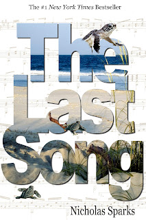
I chose The Last Song as my second book to do a cover of. I knew I wanted to incorporate the beach and music into the cover because I feel like those are two key things of the book. I decided to have the letters be the beach so it wasn't the whole cover. I added a drop shadow just to define the text a little more and make it stand out. I also chose to incorporate sea turtles because they kind of symbolize the novel. Finally, I added old looking sheet music as the background and faded it a lot so it wasn't distracting. I really like how this turned out and think it captures the key aspects of the book.
Wednesday, November 14, 2012
Surrealist Sport!
For this assignment we had to choose a sport and turn it into an impossible one. I decided to use pole vaulting, but instead of a pole, use a snake. For starters, this wouldn't even be slightly possible because you would just collapse onto the ground. I think the faces of the vaulters are actually very accurate for having a snake in front of their face and makes all the images very comical. Since we were supposed to make a news article about it, I decided to mimic a newspaper and wrote up a little blurb about the article to emphasize even more of the impossibilities. I thought this was a very fun assignment and I'm happy with my final product.
Wednesday, October 24, 2012
Color Series: Magenta
Luckily, I had just taken a roll all about color for photography when this was assigned. A lot of the photos already had some pink/magentas in it but I increased it a lot just by playing with the color selector. In some of the images, I desaturated everything else so the magenta really stood out. The barn, geranium. and railing were originally red. By taking the yellow out of the image and playing around with some of the other colors, I was able to make them magenta. I think these all came out really well and capture the color of magenta.
Friday, October 5, 2012
Fliers!
This is the flier I created for the Homecoming Dance. The theme was Footloose/Barn Dance, so I found this image of a barn that was lit up and colorful. I then found an image of the inside of a barn that had colorful lights. I manipulated this image to look like the inside of this barn. I added a lot of people to the inside to finish off the party aspect. Then I darkened the sky to create the effect that it was night time. For the font, I chose something that looked like the Footloose font to bring the two together. I added an outline and drop shadow to add a glowing effect. I really like how this turned out. The colors are very vibrant and it catches your eye.
I created this flier for Spirit Week. I decided to do something simple that would highlight this years theme: Movies. I made a simple collage of the four movie posters that are the sub themes for each grade. Finally, to tie it together, I used the fonts from the movies to create the header. I tried editing the pictures to make them a little more interesting, but they were all so different and it was hard to keep them unified with such different editing.
Wednesday, September 19, 2012
Jerry Uelsmann Recreation!
Friday, September 14, 2012
Photoshop Tutorials
Custom Pattern Effects: This tutorial showed how to create a pattern that you can manipulate in an image. I chose this image that I took at a Train concert because it had a black background and was easy to add a pattern too. I chose a hieroglyphic background and I think it made the image really interesting and gave it a lot more depth. I really like how it turned out.
The Bourne Effect: This tutorial showed how to recreate The Bourne Legacy movie poster. By using HDR Toning adjustment, you can make the image very contrasty and grungy. Then overlaying it with your original image you get the perfect effect. Using paths, you can create the bars, hiding parts of the image. I think this was a really great technique and can be used for any thing you're trying to create.
*image and title courtesy of Ashley*
Aging a Photo with Textures: In this tutorial, a quick and easy way was shown to make photos vintage looking. By using a paper texture and simply applying it to the image as an overlay, you get this really cool photo. I will definitely be using this technique on more photos.
Subscribe to:
Posts (Atom)


